How to improve website accessibility?
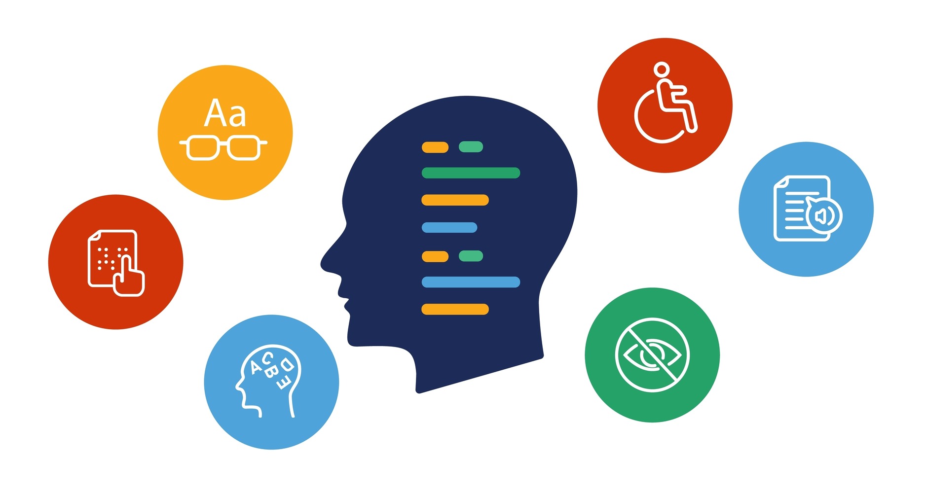
Website accessibility is a fundamental part of building an inclusive and effective online environment. Making sure your website is accessible to people with disabilities (visual, hearing, mobility, cognitive) is not only ethical and socially responsible, but also often required by law. An accessible website is also a better website for all users – improving readability, navigation and overall usability. In this article, we will discuss the key aspects of web accessibility, in line with the Web Content Accessibility Guidelines (WCAG) 2.1.
Key elements of WCAG 2.1 A and AA that you can include:
Below are the most important and commonly overlooked aspects of accessibility, many of which you can improve on your own. Remember that full WCAG compliance requires a comprehensive analysis and implementation of changes to your site’s code, content and design.
1. Alternative Text (Alt Text) for Images:
- WCAG Criterion: 1.1.1 Non-textual content (Level A)
- Problem: Missing or inadequate alt text for images. Blind people using screen readers cannot understand what the image represents.
- What to do:
- Each image must have the attribute
alt. If the image is decorative and does not convey relevant information, the attributealtshould be empty (alt=""). - Alt text should be short and concise, but still relevant. Describe what the picture represents, not just that it is a “picture” or “photo.”
- For more complex images (e.g., charts), consider adding a fuller description in the text surrounding the image or via the attribute
aria-describedby.
- Each image must have the attribute
2 Color Contrast:
- WCAG Criterion: 1.4.3 Contrast (minimum) (Level AA)
- Problem: Insufficient contrast between text and background makes it difficult to read content, especially for the visually impaired.
- What to do:
- Make sure the contrast between text and background is at least 4.5:1 for standard text and 3:1 for large text (over 18pt or 14pt bold).
- Check the contrast for all text elements, including text in links, forms and other interactive elements.
- Use online tools to check color contrast.
3 Structure of Headings:
- WCAG Criterion: 2.4.6 Headings and Labels (Level AA)
- Problem: Incorrect use of headings (e.g., skipping levels, using headings only to change the appearance of text) makes it difficult to navigate and understand the structure of the page.
- What to do:
- Use headers (
<h1>to<h6>) in a logical way to reflect the structure of the content.<h1>should be the main title of the page, and subsequent levels of headings should represent subsections. - Don’t skip headline levels. Don’t go straight from
<h1>to<h3>. - Don’t use headings just to change the appearance of the text. Use CSS styles to format the text.
- Use headers (
4 Availability of Forms:
- WCAG Criterion: 3.3.2 Labels or instructions (Level A)
- Problem: Lack of labels for form fields or incorrect association of labels with fields makes it difficult for people using screen readers to fill out forms.
- What to do:
- Each form field must have a label (
<label>). - Use the attribute
forwithin<label>and bind it to the attributeidthe corresponding form field. For example:<label for="name">Imię:</label> <input type="text" id="name"> - Make sure the labels are legible and tell you what data to enter into the field.
- For required fields, use the attribute
requiredattribute and inform the user about it.
- Each form field must have a label (
5 Keyboard Navigation:
- WCAG Criterion: 2.1.1 Keyboard (Level A)
- Problem: Not all interactive elements on the site are accessible via the keyboard, making it impossible for people who cannot use a mouse to use the site.
- What to do:
- Make sure that all links, buttons, form fields and other interactive elements can be selected and activated with the keyboard (usually using the Tab key).
- Make sure that the tab order is logical and corresponds to the order of elements on the page.
- Provide a visible focus indicator for keyboard-selected items. The default browser indicator is often insufficient.
6 Distinguishable:
- WCAG Criterion: 1.4.1 Use of color (Level A)
- Problem: Color is used as the only way to convey information.
- What to do:
- Don’t use color as the only way to distinguish elements or convey information. For example, if links are distinguished only by color, add an underline or other indicator.
7 Language of Page:
- WCAG Criterion: 3.1.1 Site language (Level A)
- Problem: The lack of a declared page language prevents screen readers from reading the content correctly.
- What to do:
- Set the page language in the attribute
langelement<html>. For example:<html lang="pl">for the Polish language. - If there are text fragments in another language on the page, mark them with the attribute
langattribute in the corresponding elements.
- Set the page language in the attribute
8 Seizures:
- WCAG Criterion: 2.3.1 Threshold of three flashes or below (Level A)
- Problem: Flashing or blinking content can cause epileptic attacks in some people.
- What to do:
- Avoid using flashing or flashing content.
- If you must use flashing content, make sure the flashing frequency does not exceed 3 times per second.
Implementing all of the WCAG recommendations can be time-consuming and require specialized knowledge.
To meet the needs of website owners, we created an accessibility widget that automates many key aspects of accessibility, saving you time and resources.
Our widget offers the following features to help you meet WCAG requirements:
- Font size: Users can adjust the font size on the page, making it much easier to read for those with low vision or who prefer larger text.
- Link highlighting: All links on the site are automatically underlined, making them easier to identify for people with visual impairments or difficulty distinguishing colors. This increases readability and makes navigation easier
- Letter spacing: Users can increase the spacing between letters to improve the readability of text, especially for people with dyslexia or other reading difficulties.
- Line height: Adjusting the height of the text line makes it easier to focus your eyes on the line you are reading, which is especially helpful for people with reading difficulties or concentration disorders.
- Text to Speech: The widget allows you to select any piece of text and listen to it using a speech synthesizer. This is perfect for people with dyslexia, reading difficulties or for those who prefer to listen to content instead of reading it.
- Contrast: Users can choose different color contrast schemes to customize the site to individual preferences and improve readability for people with low vision or other visual impairments.
- Color inversion: The color inversion function reverses the colors on the page (e.g., white to black), which may be more comfortable for some people, especially those sensitive to light or who prefer dark themes.
- Cursor magnification: Users can magnify the mouse cursor, making it easier to follow it on the screen, especially for people with mobility impairments or poor eyesight.
- Show line: This function displays a thin line that follows the mouse cursor, making it easier to focus your eyes on the text you are reading. This is helpful for people with reading difficulties or concentration disorders.
- Facilities for dyslexics: the widget offers special settings such as dyslexic-friendly font, increased letter and line spacing, which significantly improves text readability for dyslexics.
- Turn off animations: Users can turn off all animations on the site, which prevents distraction and can help people with ADHD or other concentration disorders. In addition, it reduces the risk of triggering epileptic attacks in people who are sensitive to flashing elements.
- Hiding images and videos: This feature allows you to hide all images and videos on a page, which improves text readability and reduces cognitive load for people with concentration difficulties or ADHD.
- Saturation: Users can adjust the color saturation on the page, which can be helpful for people with color vision disorders or for those who prefer more muted colors.
Important: Our widget is not a replacement for a comprehensive approach to accessibility. Changes to content, code and site structure are still necessary to achieve full WCAG compliance. Our widget is a tool that supports this process and makes it easier for users to customize their site.
Accessibility is an ongoing process. We encourage you to read the full WCAG 2.1 guidelines and regularly test the accessibility of your site.
What you can do next:
- Read the full WCAG 2.1 guidelines: The document is available on the W3C website: https://www.w3.org/TR/WCAG21/
- Conduct an accessibility audit of your site.
- Make the necessary corrections.
- Regularly test the accessibility of your site.
- Consider using the services of a professional accessibility auditor.
- Try our widget: Our widget can help you meet some of the WCAG requirements and make your site more accessible to a wider audience.
Remember, accessibility is an investment that pays off. Improving the accessibility of your website will not only help people with disabilities, but will also improve the overall user experience and increase your company’s reach.